Joelle M. Abi-Rached, MD PhD
Chercheuse invitée, École normale supérieure
Chercheuse invitée, Centre Alexandre Koyré | EHESS
Mellon Postdoctoral Fellow, Society of Fellows in the Humanities,
Columbia University
http://joelleabirached.com
After the novel coronavirus (COVID-19) epidemic began in Wuhan, a city in Eastern China, and started to spread across the world, the Center for Systems Science and Engineering at Johns Hopkins University developed and made public on January 22, 2020 an interactive web-based dashboard tracking in real-time the global number of new cases, recoveries, and deaths, in both linear and logarithmic modes. The dashboard has become the obsession of millions of ordinary people around the globe. Since then, other big data websites and tracking tools that offer equally hypnotizing models and maps have sprouted: Worldometer is one of them, Databrew is another. Simulations of the various strategies on how to flatten the curve and hence slow the exponential growth of the epidemic were published in the Washington Post, and the New York Times has designed a deaths tracker for countries in their morbid race towards the tragic (Italy) or salvationist trajectory paths (South Korea).
Of course, visualizing the spread of epidemics is not new. Perhaps one of the most striking and consequential uses of maps to get insight into the cause(s) of an epidemic is the maps of the 1854 cholera outbreak in London's Broad street region by Dr. John Snow, a British physician and medical hygienist. Snow mapped the cases, or what we would call today the clusters, of cholera and correlated them with pumps that turned out to be unsanitary. Some historians have claimed that this epidemiological visualization in an age dominated by miasma theories radically changed data visualization. Microbes, the invisible enemy, could be seen for the first time.
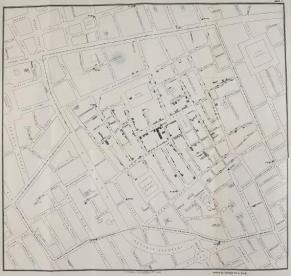
Figure 1. John Snow, On the Mode of Communication of Cholera (London: John Churchill, 1855). By permission of the British Library Board
In contrast to the static and unidimensional nineteenth century maps, the data visualization of the evolving COVID-19 pandemic has at least two features: (i) it is dynamic and rapidly evolving and (ii) the big data it reflects and exploits at the same time is used to demonstrate the devastating power of the exponential growth of epidemics and their frenzy pace in a globalized and connected world. One graph in particular that had such a powerful impact is figure 2. Devised by Mark Handley, a professor of networked systems at University College London, the graph shows how dramatically evolving the situation was/is. China it appeared from this graph was not that far after all. The graph was a wakeup call for many governments and citizens around the world who were still in denial of the potentially devastating impact of this novel virus. Europe, it also appeared from this graph, was quickly being affected by the epidemic, becoming the center of the pandemic as the World Health Organization declared it on March 13, 2020, i.e., a few days later after the graph was published.
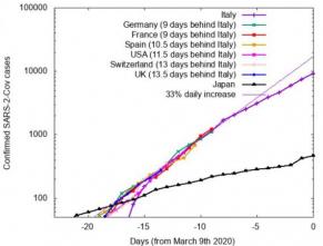
Figure 2. Mark Handley tweeted this graph on March 9, 2020 charting the trajectories of various countries in terms of the growth of confirmed cases of COVID-19 compared to Italy (purple).
Of course, maps, diagrams, data visualization, statistical models, and graphs are useful and powerful tools but one must remember that they also neatly conceal the messiness of the world, the complex decisions that are involved, the economic and political calculations that weigh on these decisions, the psychological impact on individuals and communities, the draconian, and as we saw in many countries especially, China, South Korea and Israel that had recourse to tracking technologies (mobile apps) the intrusive measures that are implemented in times of crisis and the impact these new surveilling tools can and will ultimately have on the nature of democratic governance, indeed on democracy itself. To borrow the concept from Michel Foucault, a new biopolitics seems to be in the making, one that could be called a bio-tracking governmentality.
There is also a temptation to fetishize these visualizing tools. There is a temptation to believe that they represent reality itself though many historians of science have convincingly argued that these tools are simplistic and reductionist. At best, they can speculate and project trajectories and case scenarios, but they imperfectly capture reality (case fatality rate being an obvious case in point). Moreover, these visualizing tools create new realities (for example, the evolving pandemic, which is a different object of study and concern than the original exponential curve of China's local epidemic; the first vs. the second waves of case fatalities as well as their local consequences is again another dreaded changing dimension of this pandemic).
In short, yes visualizing tools and big data can and should guide policy-making (flattening the curve has become a mantra) but one should also remember that they capture at best a partial snapshot of a much more complex reality that ultimately needs to be described, reconstructed, and analyzed to have a better insight into the nature of epidemics/pandemics and what they reveal about governance, public health policies, policy-making, preparedness, prevention, collective and individual behaviors, social beliefs, socioeconomic models, and above all I think the resilience of both societies and forms of governance, indeed the resilience of globalization and global capitalism.
|
|
|||